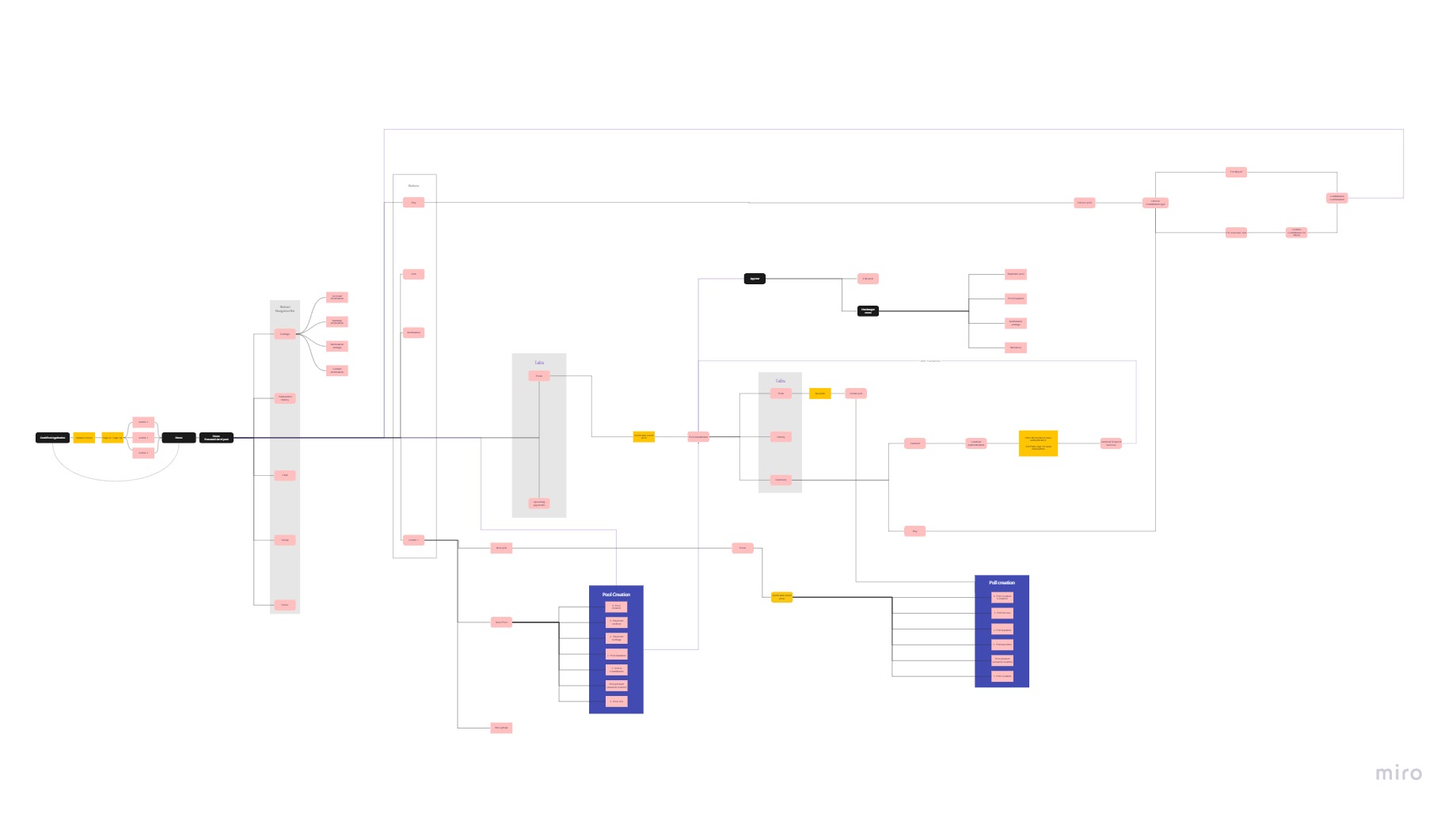
case study

Cash
pool

2021

Brief : Cash pool is an app which lets users create teams and pool money towards a common goal. Application provides easy and transparent bookkeeping among the team

Initial hypothesis

Students or young adults with limited resources who are part of a community often find it difficult to collectively arrange money for their goals.

Goal

To create an application that allow users to create teams and pool money towards a common goal.

The application will enable effective and engaging interaction between the users with high transparency.

Process

My UX Process

Empathise

Cash pooling is an activity involving multiple users and it is very critical to understand the human interaction dynamics. 

We have an initial hypothesis that there could be variation in the behaviour of the users based on their age, stability and level of income. To evaluate this we conducted focus group workshops and interviews. (We included working adults and students in our interviews.)

5 Focus Groups Workshop

The focus group sessions were used to simulate live cash pooling activity within a group of friends. I conducted 2 sessions with 3 participants each. We also had external interventions to simulate real-life situations.

Key Findings 

(Interpersonal communication)

Understood the cash pooling process.

Mutual trust is expected in the group. (But people didn’t share how much money they had)

Changing the goal of cash pooling requires discussion.

Communication is key. Sometimes information is not relayed properly between people

As a group, they can decide about whether everyone can know about individual contributions

17 individual interviews 

+ Card sorting

We had online interviews with users on their experience and expectations of money pooling. And at the end of the interview, we gave randomised value statements to participants and asked them to sort the cards into 4 groups based on importance.

Key Findings 

(Individual)

Varied level of commitment to cash pool.

The preference of the transaction method is different.

The choice of a leader varies (most responsible, eldest in the group, one who started the pool, one with most money contributed and more.)

May borrow money or default on payment.

Based on the goal and urgency, people may borrow the money and add to the pool.

Key findings from card sorting

Card sorting helped to identify the priority for key values towards cash pooling among teenagers and young adults

Define

I and my 5 groupmates need to buy a common item and I need every one of us to easily and efficiently contribute periodically because I don’t have enough money or individual requirement of the item.

Insight

HWM
(How might we)

How might we help a group of people to contribute money periodically in an easier and transparent manner?

With detailed analysis of the user research we were able to define 

  1. Two User profiles.
  2. Two User Roles
  3. Task organisation model.
  4. User journey map.

Validating our initial hypothesis we found two user profiles, which mostly share similar values but different frustrations and abilities.

Task organization

From the focus group workshop, we were able to collect the different tasks and prioritized to make a task organization model.

Environment analysis.

The application needs to cover both the user profiles and various contexts of use. An Environment analysis can help us understands better.

Operational risks

Money being stolen or misused.

Risk of misunderstanding: delayed/missed/incomplete payments.

improper transaction log.

Spoiled personal relationship

Physical environment

Home to Office to While travelling.

Anywhere, different lighting conditions, noise levels and distractions.


Social environment

Level of trust between the person

Close relationships (friends, families, coworkers, housemates, etc)

Respectful and mindful of each other.

Shared living space.

Technical environment

Phones, Tablets, Desktops, Laptops

ATM transactions

Net banking or online banking

Shared google sheet for transaction log

User roles

It was evident from our research that there are two user roles in money pooling Leader and the member. 

Leader

The person responsible for managing the money pool. He is part of the team and is selected by the team.

Special requirements :

Get informed when pool activities are not following the schedule.

Settle dispute.

Handles the pooled money

Memeber

Person who is joining the pool, contributing money towards the common goal.

Requirement :

Add money to the pool.

Check the status of his contribution and pool.

Raise issues.

User Journey Map

From the information gathered, we organized the user tasks and then created a User Journey Map to understand the users experience throughout the process.

UJM of Teenagers

UJM of working adults

Ideate

With detailed understanding of the user tasks we started brainstorming session and sketching.

Sketching

We used dot voting to define each feature, further brainstormed on them, rearranged them taskwise to identify missing screens. We understood from the user analysis that working adults use desktop applications, hence we included both  web and mobile application in the low fi prototype stage. 

Mobile

Web

Prototype

Converted our rough sketches into low fi prototype using figma. Main features: 

  1. Pool creation & management 
  2. Resolving conflicts through polling 
  3. Pool Participation

Low fi prototype

Testing

8 Usability Testing

We conducted 8 usability testing with 5 female and 3 male users of which 5 belong to the working adult’s profile and 3 to the student profile. We followed the approach of one person facilitating the interview, and the second person observing. The task document was shared through google docs and the prototype was tested in Figma while screen sharing. 

Effectiveness

We defined the optimum steps required to complete a task and kept it as a benchmark to evaluate the prototype and deviation from this is counted as a mistake.

Web prototype is better for Task 1 and mobile for task 2.

Any elemental action done by the user is recorded and compared among the different tasks. This helps in identifying areas of the interface that are confusing the user. 

Mobile is more efficient.

Efficiency

User satisfaction

We used the standard User satisfaction questionnaire to evaluate if the users liked the appliaction.

More positive and convergent results for CashPool Web. 

More negative and divergent results for CashPool Mobile. 

Users reported a more satisfactory experience with the Web prototype.

Usability Issues 

Mobile (with rankings)

Usability Issues 

Web (with rankings)

Design comparison

Component level

Landing page : User dashboard

“Better time-based overview”, “Sense of urgency”, “More useful” – Quotes from test participants for web

Contribution frequency input

Observation: Web has more freedom but requires more thinking, lack constraints (e.g  2 weeks = 14 days)

For the final prototype we wanted to develop the best among the two and Cash pool mobile was the clear winner.

Hi fi prototype

From the results of the low fi iteration, we had a brainstorming session and finalized on

  1. The list of screens.
  2. Navigation map for the Leader and Member.
  3. Observation sheet.
  4. The optimal time for each task completion.
  5. User satisfaction questionnaire (SUS questionnaire)
  6. User experience (UEQ questionnaire)
  7. Improvements of usability issues

Screen

Description

Splash Screen

A quick screen briefly displaying the app logo
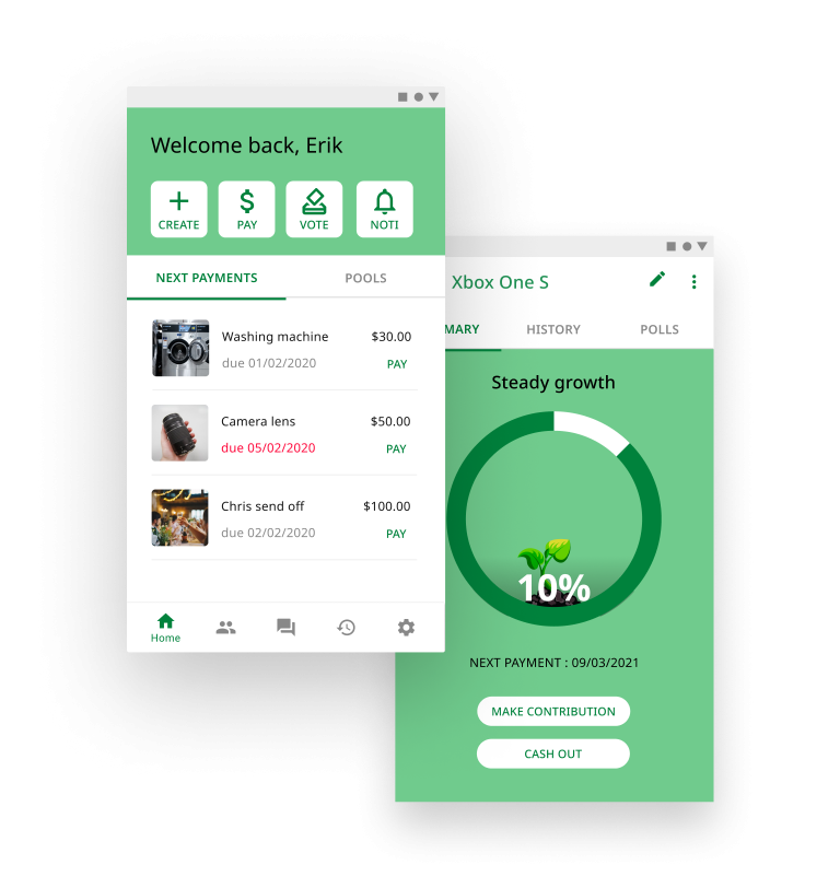
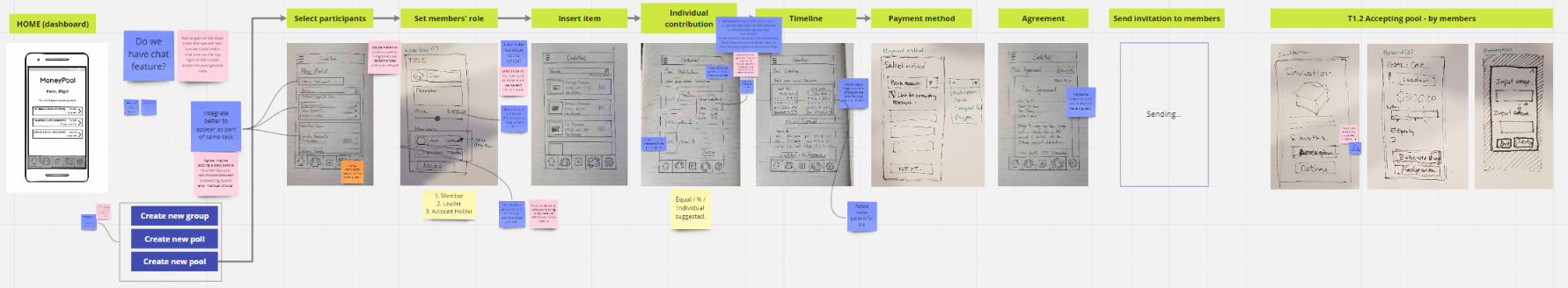
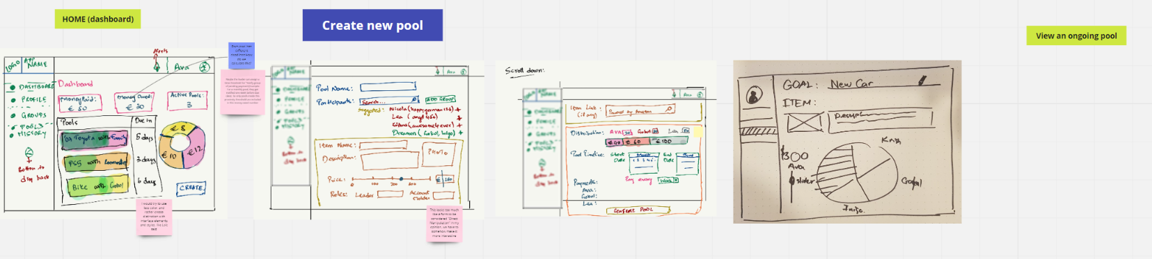
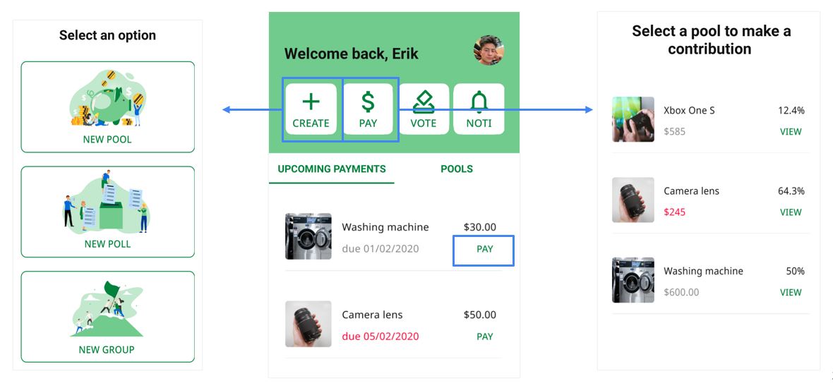
Home

The home page can be used to access all functions, this is the page the user is greeted with when he/she opens the app.

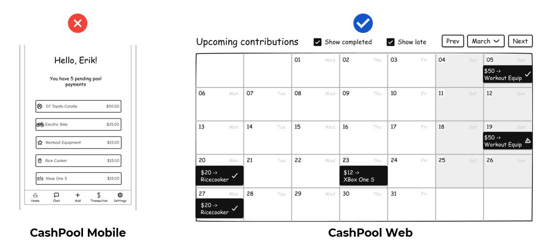
Upcoming Payments,Pools – Tabs in Home Screen

These screens are part of a tabbed layout that can be used to easily make any payment or  go to any pool from the home screen.
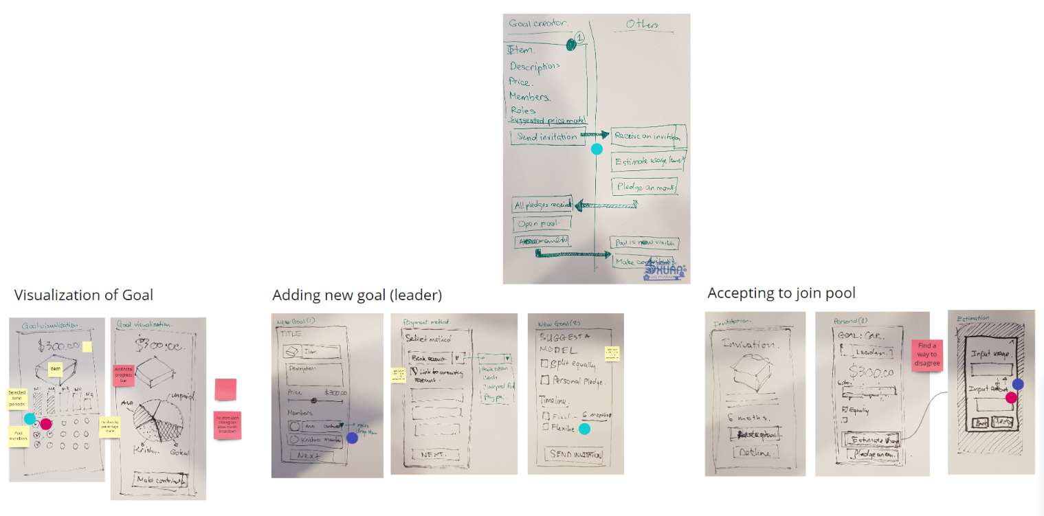
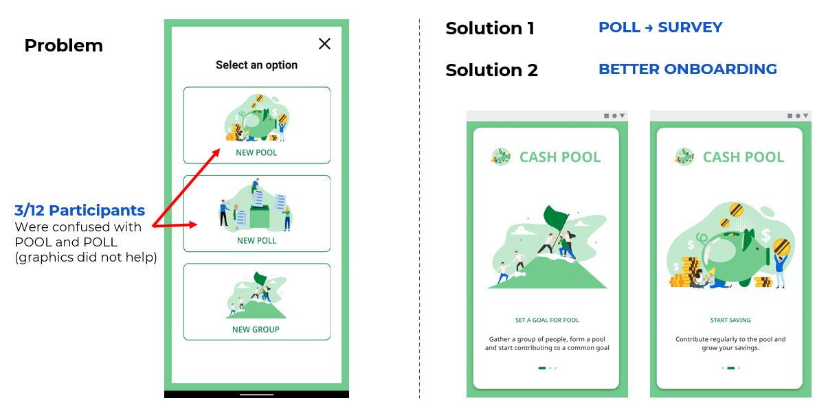
Create

The user can use this to create Pool,Poll or Group.

Pool info

The user inputs all the required data for the pool in this screen (Like Pool Name,Amount,Description etc).
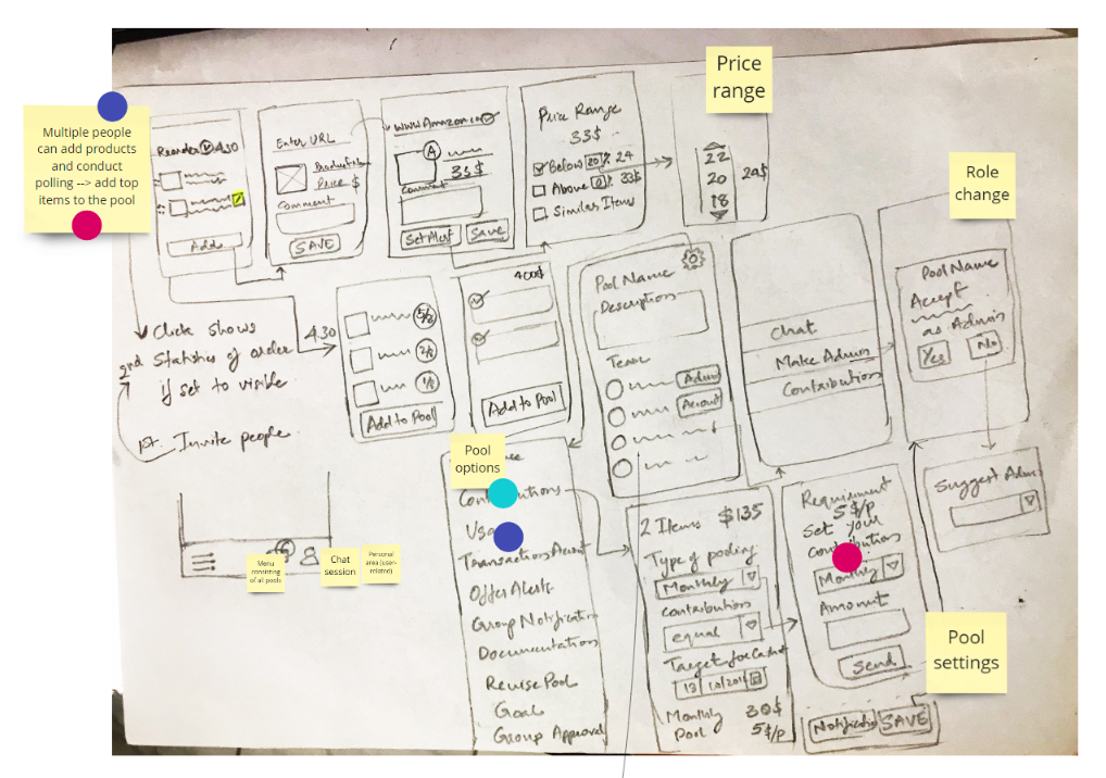
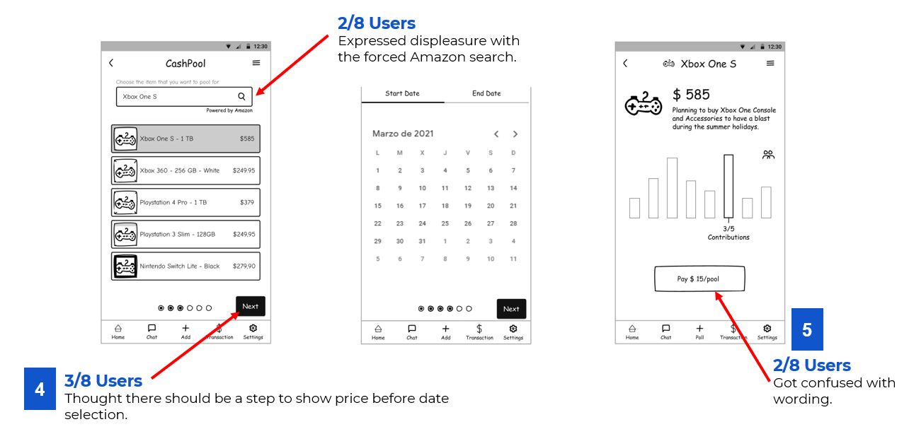
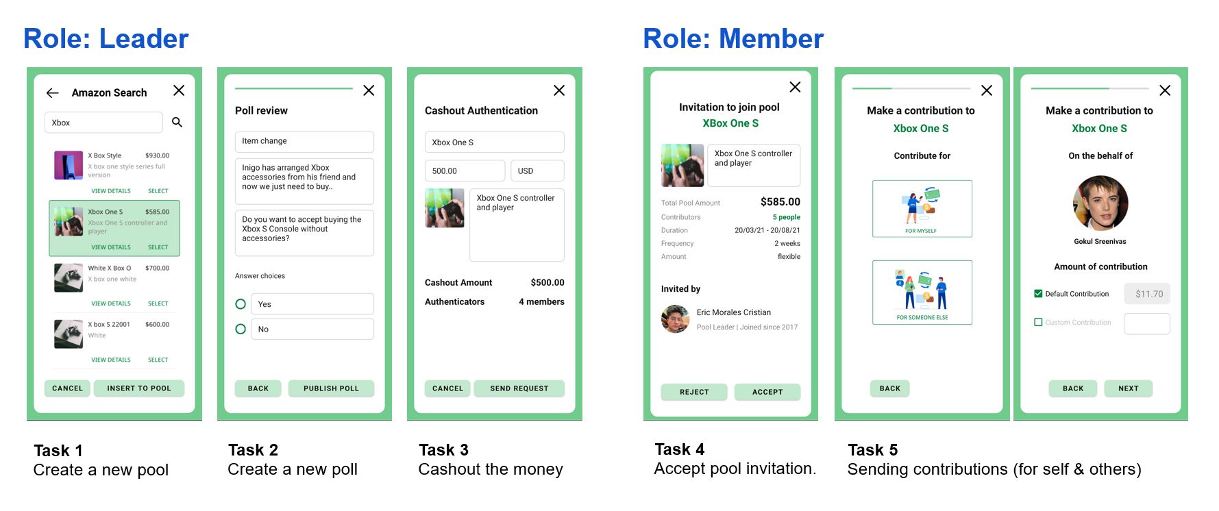
Pool product (Amazon Search)

This screen is used to search the required item on Amazon.

Select Contributors

This screen is used to add in the rest of the members participating in the pool.
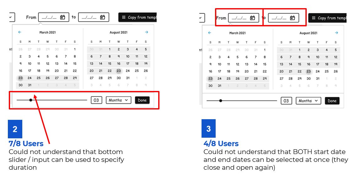
Pool Duration

This screen is used to set the pool duration (i.e. when it starts & when it ends).
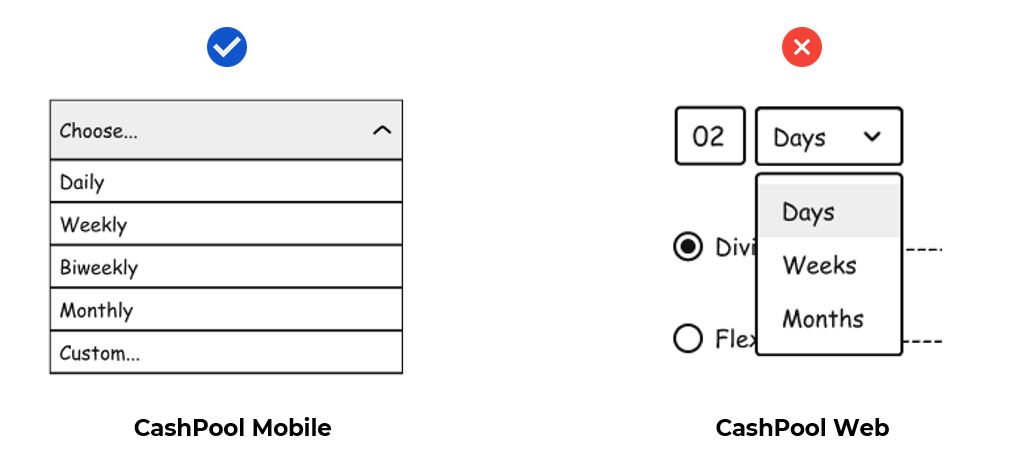
Payment Settings

This screen contains the required payment settings (like the frequency, etc).

Payment Methods

This screen is used to select the required payment method.

Pool created

A screen to let the user know that the Pool is created.
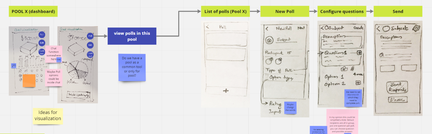
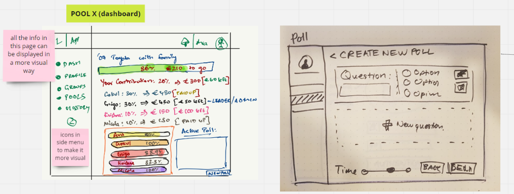
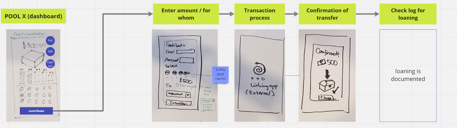
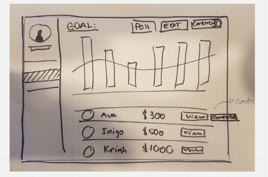
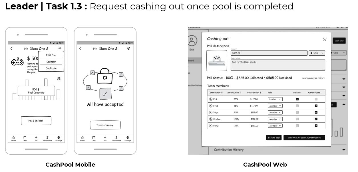
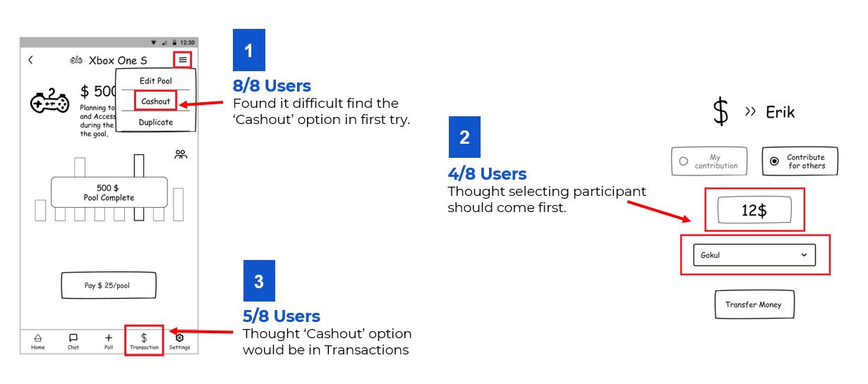
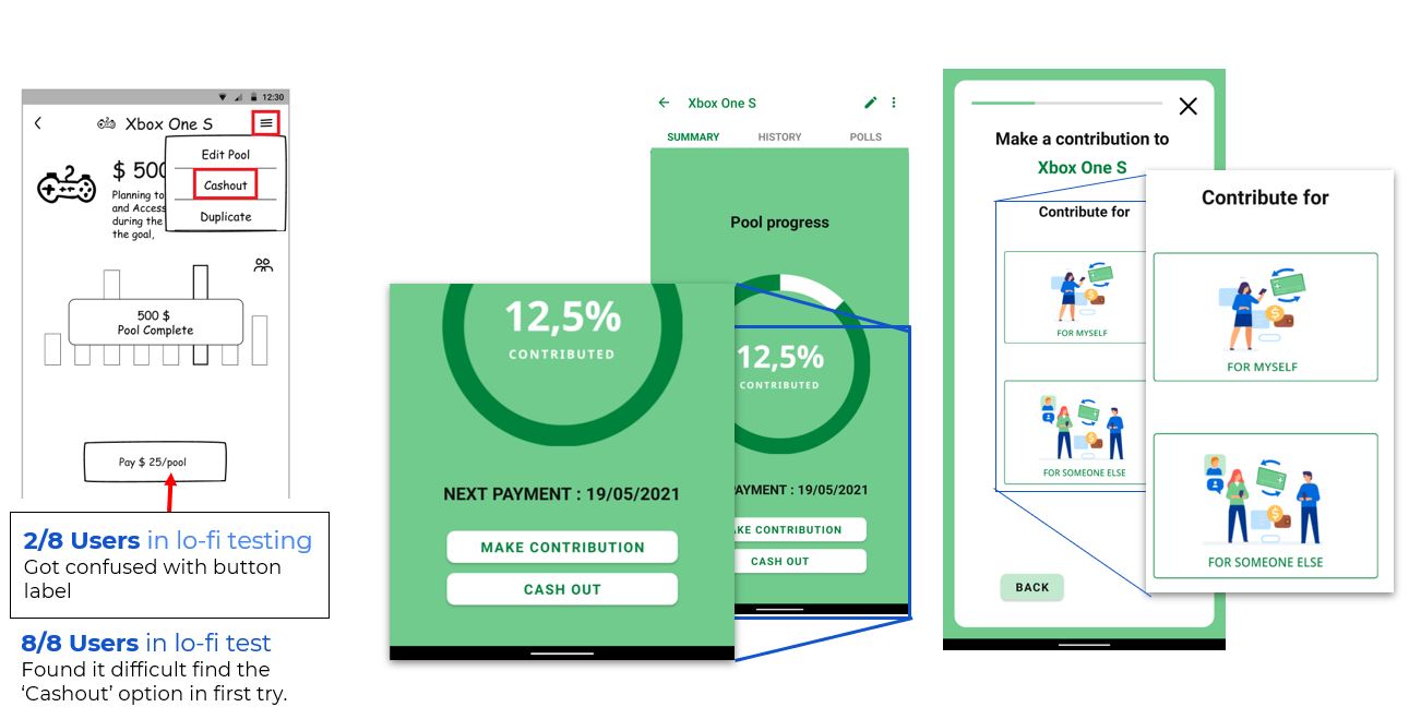
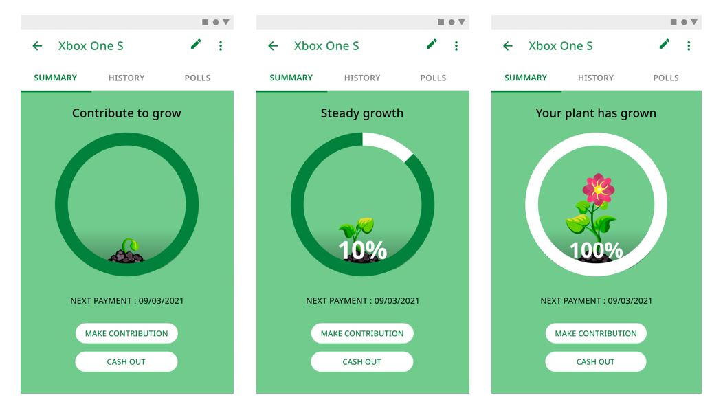
Pool dashboard ( Xbox One S)

This screen is used to provide the user a quick glance about the pool. Has a tabbed layout with Summary, History and Polls. With Summary being the default one.

Pool History

Contains a list of transactions, polls that took place throughout the lifetime of the pool.
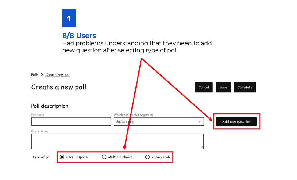
Poll Creation

This screen kicks off the poll creation process.
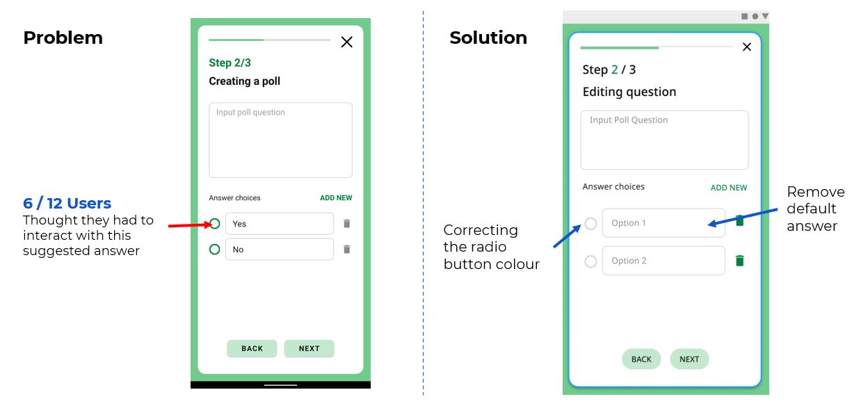
Poll Question

This screen takes in the question details and answers

Poll Duration

How long will the poll be active for?

Poll Review

A summary of the people to help users sort out mistakes before publishing.

Poll Creation Complete

A screen to let the user know that Poll is created.
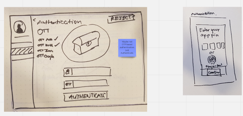
Cashout Authentication

This screen sends a request to every member of the pool about retrieving the money collected for the pool and buying the product.

Cashout Request Success

A screen to let the user know that Cashout Authentication Request has been sent.

Pool Invite Popup

This popup lets the user know that someone has invited them to be a part of a pool.
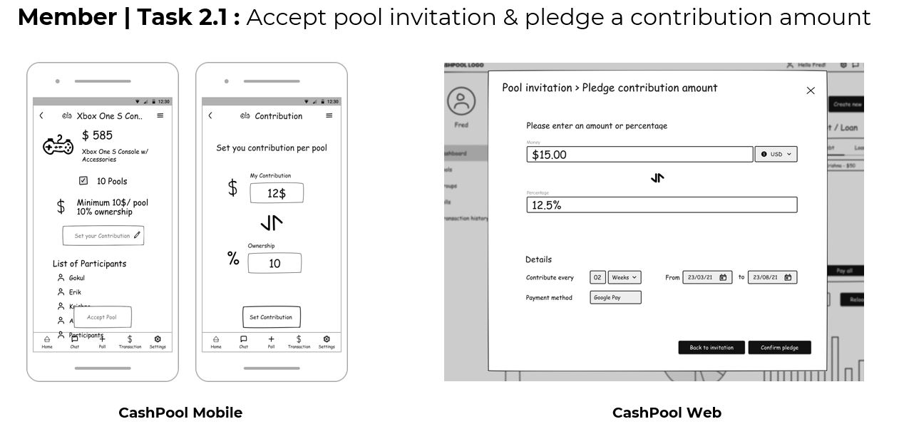
Pool Invitation

This screen contains the information regarding the pool, giving the user an option to accept or decline the pool.
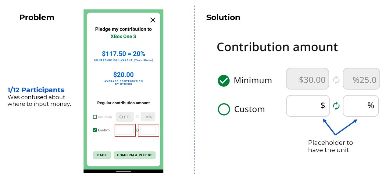
Pledge

This screen gives the user information about the amount of money that they need to shell out for this pool.


Pledge Confirmation

This screen lets the user know that they have successfully accepted the pledge.

Choose pool (when clicking payment from home screen)

This screen shows the list of pools open for contribution.
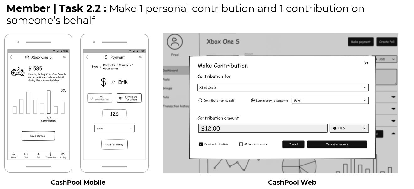
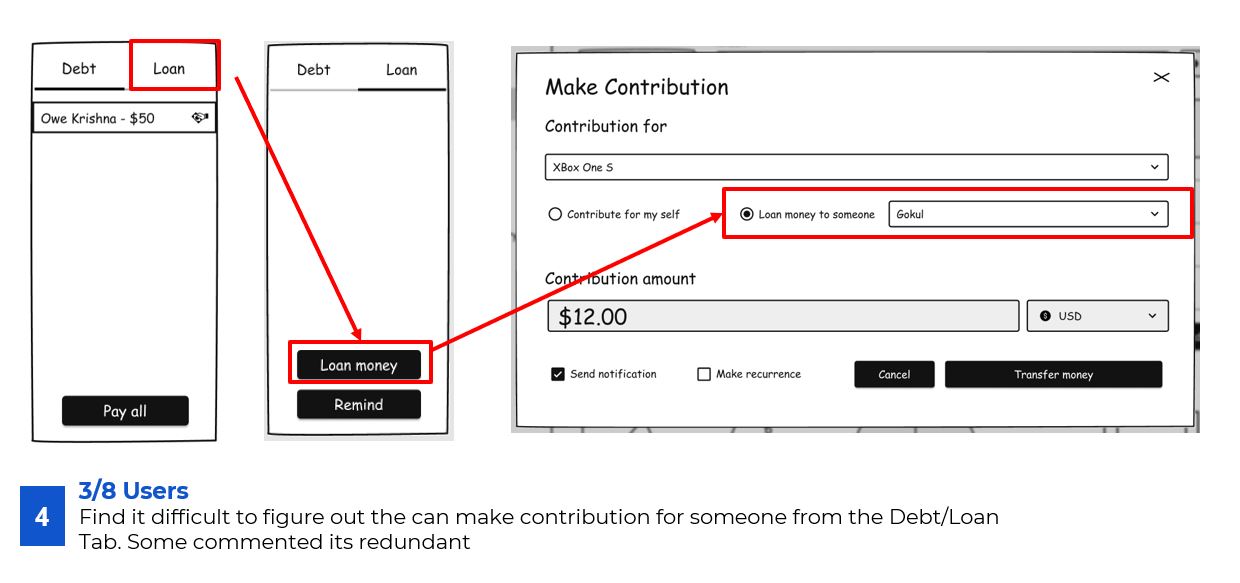
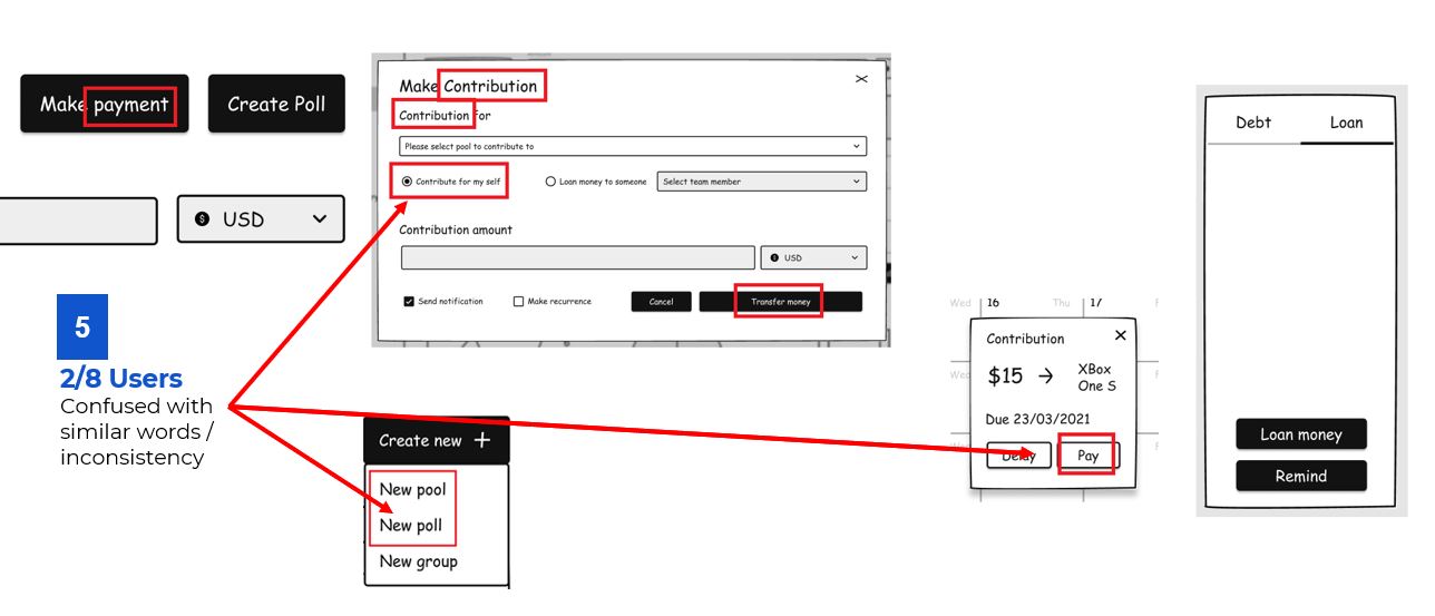
Choose Contribution type

This screen is to select whom to make the contribution for – For Myself the user themselves or For Someone Else on behalf of someone else.

For Myself (Make Contribution for themselves)

This screen is to let the user pick the amount of money that they plan to contribute at the current moment.

Contribution Confirmation

This screen is to let the user know that their contribution has been successfully sent and the leader has been notified.

For someone else (Make Contribution for someone else)

This screen is used to search and choose the person on behalf of whom the user plans to contribute.

Confirm Contribution for others

This screen is to let the user know on behalf of who and how much money is required to be contributed.

Navigation map for Leader 

Navigation map for Member

The optimal time for Each task 

Observation sheet

To protect the privacy of the participants we used unique coding to identify them. The Observed measurements in the observation sheet are as below

Measurement

Description

Time

Time required to complete one task

Actions

Number of elemental actions performed (click, tap, …) to complete one task.

Mistakes

Number of mistakes made during one task.

Success

Yes/no (whether the participant succeeds at completing the task).

User tasks

Improvements from Low fi

Shortcuts to commonly used functions

Improved button label & flow for contribution

User testing result

We recruited a total of 12 participants whose age range is between 17-33 years old, fitting with our 2 user profiles of students and young working professionals. Out of 12 participants, we have a balanced representation of both gender: 6 females and 6 males.

Effectiveness

Hi fi prototype had less number of mistakes than the low fi prototype. We improved the previous usability issues, provided clear instructions in UI copy-writing. Simplified the steps and reduced the information per screen.

It is interesting to note that working professionals make fewer mistakes than students.

Efficiency – Time

Some of our initial optimal time for tasks needed to be changed after the first two pilots as the time to understand the task was a bit more that the initial estimate.  Most tasks are performed close to the optimal time, except task 2 (mistake) and task 4 (longer path)


Time (avg.)

Time (std. dev.)

Optimum time

Ratio between average time and optimum

Task 1

218.33

38.12

210

1.04

Task 2

109.08

31.20

96

1.14

Task 3

22.92

3.37

25

0.91

Task 4

42.5

14.41

35

1.21

Task 5

52.08

10.27

48

1.09

The efficiency remains more or less same or is slightly reduced, this is a trade off between avoiding mistake vs. efficiency as steps were broken smaller and less information is presented per screen.  But the decrease, is not significant the perceived overall efficiency is still Excellence according to the UEQ results.

User satisfaction (SUS)

Hi fi prototype has a more positive and convergent results over the low fi prototype.

Overall score went up by over 10 points and the standard deviation went down by over 10 points.

UEQ Analysis

The User Experience Questionnaire shows very positive results for our application, except for Simulation and Novelty all parameters show excellent. Lower simulation score shows lower motivation for users to continue using the application and Novelty is low as the concept is not new.

Usability problems in hi-fi & improvements

The overall usability issues were low because of the low fi iteration, the few issues that occured are ranked and listed below.

Rank 1 : Improved button label & flow for contribution

Default Yes and No options where given for ease of use but they created some confusion among the users.

Rank 2 : Confusion with terminology

Users are not very familiar with the terminology Pool and Poll, we added icons to make it more understandable but this was not enough. To improve this we can change the UI copy from Poll to Survey. To familiarize the user to new concepts a better onboarding screens can be made. 

Rank 3 : Wrong Input for Money/Percentage

We thought it could be inferred from the values in the minimum column, but it was not very evident for many users on where to enter the money.

Further improvements for Stimulation & Novelty (UEQ)

Gamification to improve engagement

Visual incentives and point based gamification can be done to motivate the user to complete the pool.

Project conclusion

User Research

Key insights about needs & behaviours

→ Design appropriate features / flow

Ideation & lo-fi

Experimentation of ideas

Tried and tested several design elements → selecting from the best

Better understanding of behaviour

Hi-fi prototype

Fine-tuning each component

Execution in Android

In-depth understanding

Significant Improvement

Thank you for going through my case study, I would appreciate your feedback.