Prototype

Shopper's Map

2020

Brief : Shopper’s Map is a new way for users to shop at their supermarket. The user can form a shared shopping list and the app allows for a better navigation experience.

Problems

1️

Shopping for a group is difficult, considering all the individual requirements, updating them and delivering items.

2

I want to be flexible on how I do the shopping. Quick, when I don’t have time to look around for items.

Goal

To create an application that allows the whole family to use a shared shopping list.

To create an instore navigation map of the supermarket and aid in better collection of items.

Process

My UX Process

Empathise

Belonging to the same user group of shoppers, we hypothesised that shopping for a family could have some difficulties and wanted to investigate further.

12 User Interviews

All interviews were held online through video calls, I recruited and interviewed 3 people. As a team we had collectively prepared the interview questionnaire and an observational template.

Key Findings

Planning

1. Most people want to shop quickly. But depending on their time availability they want to look around.

2. Majority writes a list and know what they want to buy.

3. Written list vs. mental list


Shopping

1. General problems: getting lost in the supermarket, not finding items.

2. Most people plan the order of putting items in their cart to some extent.

3. Everyone is annoyed when supermarket changes the location of items

Define

Then we came down as a group and had a brainstorming session to note down our ideas and aggregate our findings to set the goal. The outcome of  a series of 3 long meeting was 

  1. Affinity Diagram.
  2. Two User Profiles.
  3. Value proportion canvas.
  4. Empathy map derived from the VPC.

We found that based on the way users shop, there are two profiles emerging with different goals and expectations. And we did not have enough information on each profile to make a persona. So we made User profiles.

We identified two problems and defined the goal that needs to be achieved to solve the problems. They are mentioned at the starting of the case study.

Ideate

User Journey Map

From the information gathered, we organized the user tasks and then created a User Journey Map to understand the users experience throughout the process.

We now focused only on the family shopper, as addressing the needs of this profile would address most of the needs of the Student profile. During prototyping we intend to test with profiles and validate,

Design Sprint

We were lucky that our Prof. Ricardo had conducted a Design sprint workshop for us, that fast forwarded the design process. I assumed the role of technology expert as our system planned to include some IOT (Bluetooth Low Energy). 

We used the 4 step sketch

  1. Notes
  2. Ideas
  3. Crazy 8s
  4. Solution Sketch

Carzy8’s

We then mapped our ideas on to the Task organization model we built during the sprint from our UJM. And rated our ideas. Below you have my solution sketch and our TOM

Story Board

Prototype

The Usability Attributes which were given top priority for the design where

  1. Efficiency
  2. Effectiveness
  3. Satisfaction

Interaction style would be Menus and Form, device Mobile.

Based on the TOM we defined a controlled Task and a Task Scenario with our Low fi Sketches. Due to time constraints, we couldn’t test our Low Fi sketches so we conducted testing on the High Fidelity prototype.

We have tried to use Material Design in our design.

I understand the principles of modular design, design systems, libraries and varients for fast and efficient prototyping.

Testing

16 Usability Testing

Interactions

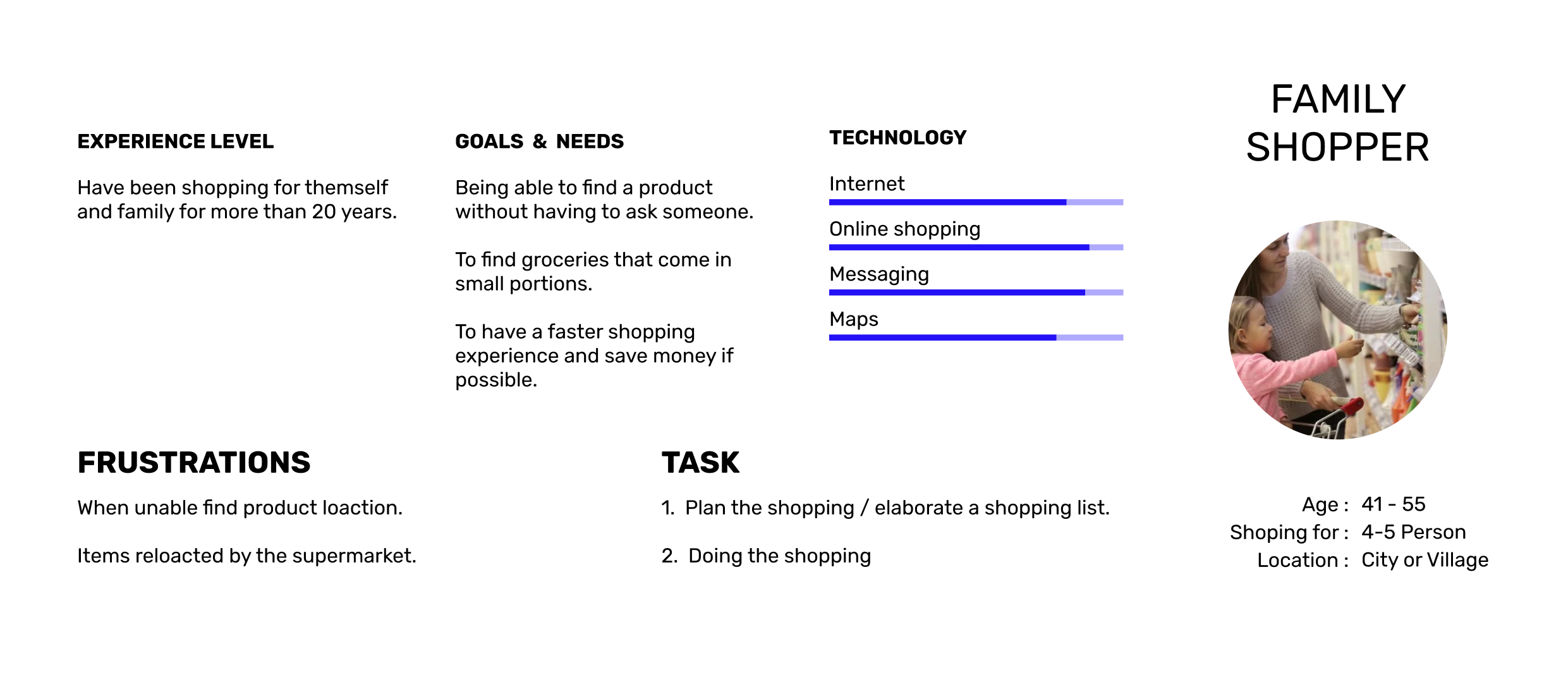
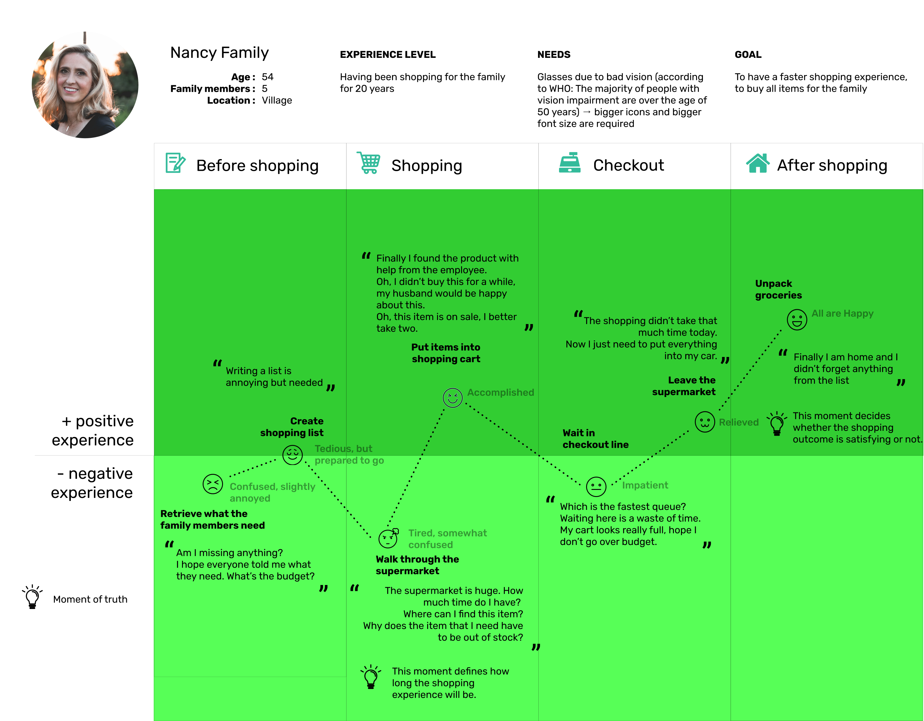
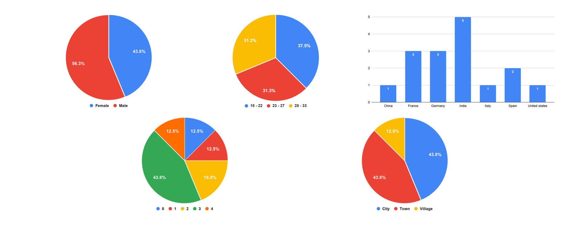
Imagine that you are Nancy, a 54-year-old mother, living in Dublin with your husband Mike and your son Milan. You have been doing the grocery shopping for the whole family for 20 years. Being responsible of buying the groceries for everyone as well as working full-time has its obstacles and is stressful. Nancy’s goal is to have a fast shopping experience and to buy all needed items for the family. Apps like the ShoppersMap app help you to manage the planning of the shopping in collaboration with your family as well as to get the shopping itself done quickly, adjustable to your needs and current situation.

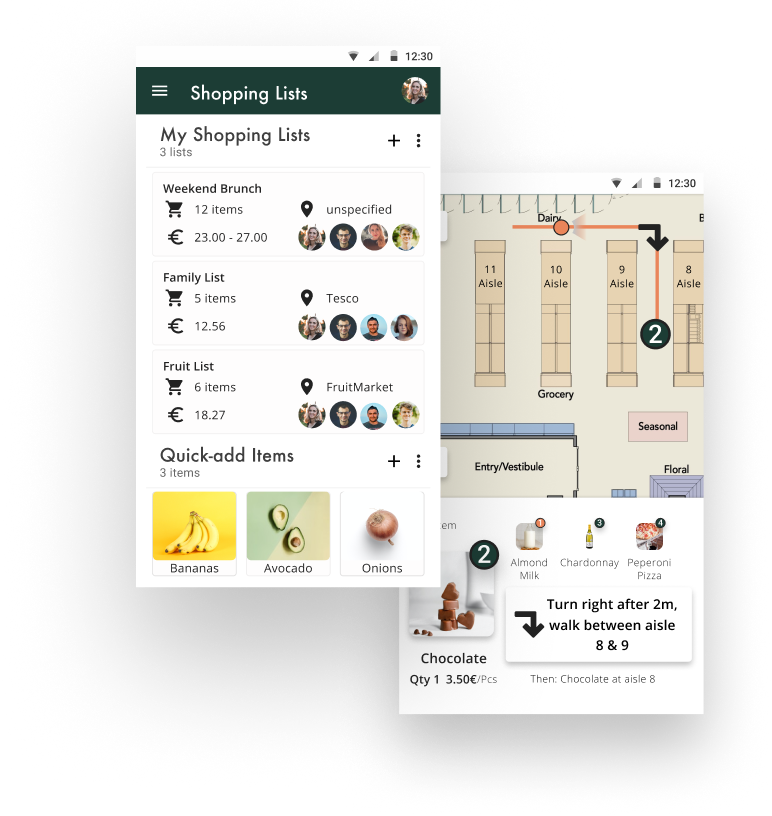
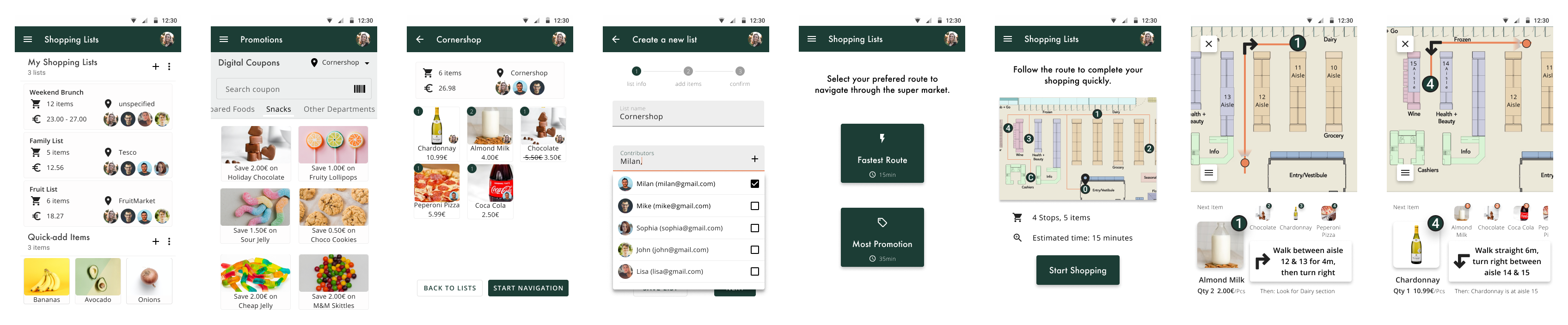
Imagine that you already used the ShoppersMap app several times; you and your family as well as friends use it regularly. Recently, your friend recommended the Chardonnay white wine from the newly opened Cornershop supermarket to you. Since you have never been at the Cornershop supermarket before, and you have a weakness for Chardonnay, you decide to visit the supermarket when you pass it the next day on your way home after work. You don’t intend to do the big, weekly family shopping there because you don’t have that much time as you need to get home to prepare dinner afterwards. Therefore, you create a new shopping list specifically for the Cornershop supermarket and want to get the shopping itself done quickly then.

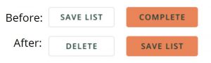
You want to use the ShoppersMap app to create a new shopping list for your upcoming shopping in the “Cornershop” supermarket, and you decide to name the list like the supermarket. You want to share the list with your son and husband. Also, you want to include Chardonnay white wine as well as 2x Almond Milk in the list. You are in the mood for some snacks, and chocolate is your favorite. If you can find chocolate in the snack promotions, you want to add it, too. And, when you get a notification about a new addition to the list, you want to view it.

Specific information:

  • Your name: Nancy
  • Name of the list: Cornershop
  • Name of the supermarket: Cornershop
  • Name of the son: Milan
  • Name of the husband: Mike
  • Items to search for: Chardonnay – white wine (1x), Almond Milk (2x)
  • Item to select from promotions: Chocolate (1x)

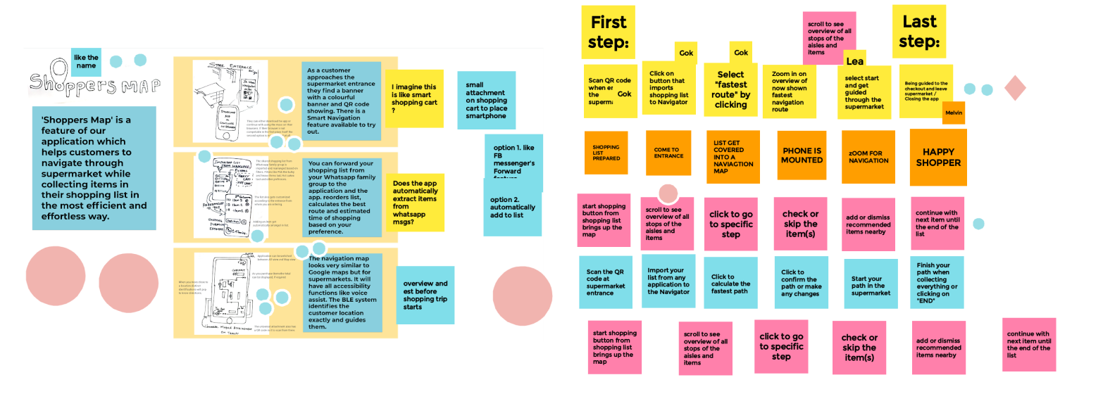
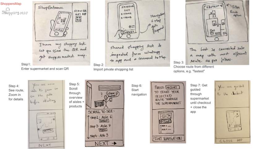
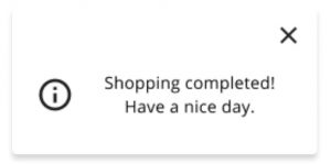
Use the ShoppersMap app to get navigated through the Cornershop supermarket until you reach the Checkout counter. You want to take the fastest route. And, when Milan adds an item during your shopping, you decide to accept the change.

Specific information:

  • Navigation: Fastest route
  • Accept addition of Coca Cola by Milan

UEQ Analysis

We used UEQ analysis for benchmarking our application, our evaluation results are below. 

Attractiveness is highest with 1,86

→ The app is attractive and likeable for the users

Hedonic Quality (Stimulation, Novelty): 1,62

→ The users enjoy interacting and engaging with the app

Pragmatic Quality (Perspicuity, Efficiency, Dependability): 1,57 

→ The users find the app practicable and they can reach their goals

2x Excellent, 3x Good, 1x Above Average

Compared to the Benchmark, our app has (very) positive results and a high relative quality

Issues & Solution

75%

Did not understand that they had to click on the map to select the store

Solution

Add a clear label or sentence like “Choose the store on the map”

Day-one issue: Unusual at first, but users will get used to it 

56.25%

Expected the + and – to be the other way around

Solution

68.75%

Did not swipe to find the snack promotions

Solution

Categories could look more like tabs 

Increase colour contrast to make categories stand out more

Add scroll bar

37.5%

Were somewhat confused by certain button labels

Solution

Change button labels.

Remove button

81.25%

Were confused with exploring / zooming / moving the map of the supermarket

Solution

Implement auto centre functionality


¡ Note

Partly due to the prototype situation, as some participants said that if they had a phone in their hand, they would naturally explore the map with their fingers and this part of the task would not have been a problem

31.25%

were confused when adding contributors to a list

Solution

Use chips for contributors